CRITICAL INTRODUCTION
TO VOLUME 2 OF THE DIAL (1892)
In March 1892, almost three years after publishing the magazine’s first number to mixed reviews, Charles Ricketts and Charles Shannon brought out a second Dial, now aptly subtitled An Occasional Publication. Although retaining the brown paper wrappers of the 1889 issue, the new volume was otherwise significantly redesigned, with its printing taken over by the highly regarded Ballantyne Press. The original quarto was replaced by a slightly larger folio format, providing even more expansive margins, and Ricketts designed and engraved a new cover. Employing laid paper instead of the previously used coated paper ensured that the inking of the letterpress would be even, while printing on a hand press maximized the visual appeal of the magazine’s typography. Ricketts supervised the printing of the Dial himself, initiating what amounted to an informal apprenticeship with master-printer Charles McCall, manager of the Ballantyne Press in London. As Maureen Watry notes, the immediate effect of this tutelage is evident in the Prospectus to the second Dial. Ricketts’s first piece of ornamented letterpress set with McCall’s help, the Prospectus displayed a greater “severity of design” than seen in the magazine’s first number (21).
The Prospectus announced that the second number was limited, like the first, to 200 copies, but at the increased price of 10 shillings and 10 pence (compared to 7 shillings 6 pence) per copy. The elevated price reflected the greater artistic value of the magazine as a whole, which eschewed photographic processes in favour of artforms in which artists could control the production of their work—what we would call original prints today. The volume marketed itself through the aura of the artist-designer and an arts-and-crafts bias toward the artisanal integrity of printing from the woodblock rather than the electroplate matrixes used by the mass press. “The woodcuts and lithographs are directly from the hands of the artist,” the Prospectus proclaimed, and “[a]ll the woodcuts have been printed from the wood to ensure the greater sweetness in printing.” The woodcuts in the issue included not only the titled illustrations listed in the Contents, but also textual ornaments designed and cut by Ricketts himself to harmonize with the type (figs. 1, 2, 7). In all, Ricketts designed and engraved six borders and four initials for the second Dial; the labour of engraving alone took many months. Reginald Savage and Lucien Pissarro joined Ricketts in providing a full-page illustration, which each artist “designed and engraved on the wood,” while Charles Shannon contributed three original lithographs, “drawn on the stone and bitten” by the artist (Contents, n.p).
The literary contents retained the previous issue’s preference for fantastic tale over contemporary short story, and also introduced a significant number of poems, some of them ekphrastic, in keeping with the magazine’s interest in the interrelations of visual art, literature, and design. The Dial’s early interest in continental art movements continued in both the volume’s poetry and its two essays, one of which, “The Unwritten Book,” belatedly outlined the editorial principles by which the magazine was governed. The elaborate headpiece Ricketts designed and engraved for the essay expresses the magazine’s commitment to a Pre-Raphaelite combination of visual and verbal art, a symbolic approach to artistic representation, and a reverence for the mysterious wellsprings of inspiration (fig. 2).
Written by Ricketts but published anonymously, “The Unwritten Book” responds directly to critical reviews of the Dial’s first volume as “mere art eclecticism” by explicating the editors’ rationale of selection. In choosing works to present in each number, the editors sought that element “common to all good art” encapsulated for them by the term “Document.” As the theoretical framework for the magazine’s editorial approach, “Document” calls attention to the relationship of artwork, artist, and spectator as triangulated by masterpieces that live beyond their moment. Such art continues to express to the viewer “a thing known” or a “remembered delight” by conveying, in an individual, idiosyncratic detail, “the record of a mere moment in transfigured life, producing and controlling it” ([Ricketts] 25). In examples drawn from classical Greek friezes, Italian Renaissance painters, and late-nineteenth century English artists, Document is shown to reside in art where “Nature is strained into symbolic action, and in an atmosphere dyed by personal feeling” (27). The editorial closes with words that gesture toward the Dial’s own efforts toward a highly individual, symbolic approach to representing nature through “fantastic details,” “the old ornamentalness,” and “lyrical movement” counterpointed by “tense immobility” 28)—all exemplified in Ricketts’s headpiece to the essay as well as in the magazine’s contents, including its textual ornaments (figs. 1, 2, 5, 7). In the elusive quality of Document, the editorial asserts, we recognize that as “Art has been, Art is, so the present touches wings with the past” (27). Although most of the examples are drawn from visual art, the essay gives its closest attention to Dante Gabriel Rossetti’s double work, the Proserpine painting and its associated sonnet. It is “in the works of the English Pre-Raphaelites,” Ricketts avers, that “document has been chiselled in new-cleft gems” (27).
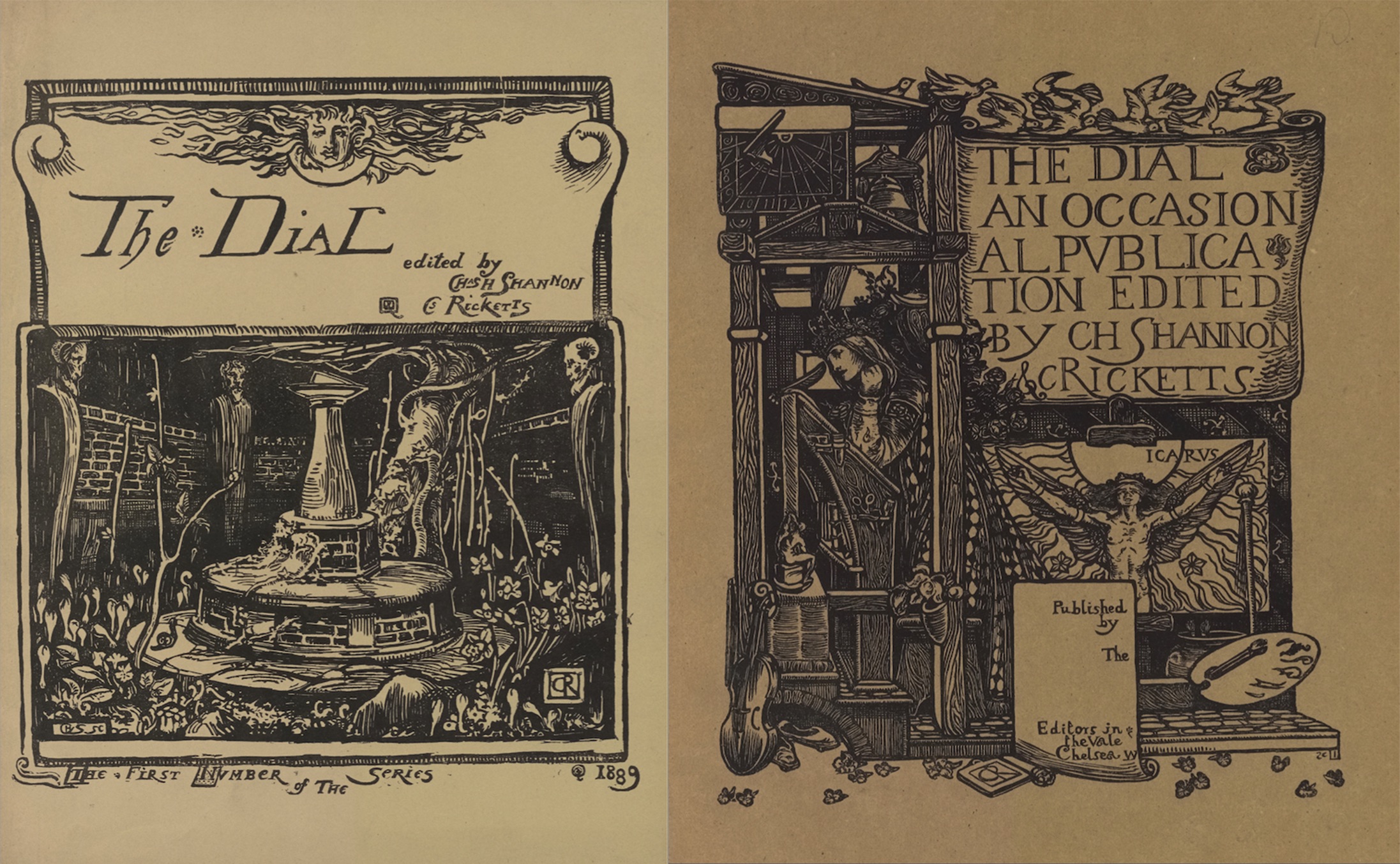
The Dial’s Pre-Raphaelite lineage is made manifest in the new cover design introduced in the second number and used for each of the remaining issues (fig. 3). In the three years since publishing the first Dial, Ricketts had immersed himself in Rossetti’s illustrations and the possibilities of wood-engraving as an artform. The new wood-engraved cover brings these two interests together, so that “the present touches wings with the past” by evoking the woodcut designs of Albrecht Dürer (1471-1528) and D.G. Rossetti (1828-1882). In a symbolically detailed representation of the arts of painting, writing, printing, and music, the cover expresses the spiritual, material, and aesthetic aspirations of the magazine. Enclosed within the wooden beams of a narrow tower, the crowned spirit of the artist kneels at a prie-dieu or prayer desk, holding a quill pen. Above this scene of creative making hangs a bell and a sundial, indicating the passing of time. A flock of white doves ornaments the decorative signboard that emerges from this structure to herald the title and name the editors. Below this is a work-in-progress: an easel painting of Icarus with wings outspread before the sun. The subject alludes to Dürer’s famous woodcut of this classical myth, while the composition itself incorporates the sundial’s complementary motif, the flaming sun, from the Dial’s first cover. The iconography asserts the big ambitions of this little magazine to make an impact on the world of art, even if the attempt should end in failure. Chief among these ambitions was a desire to gain recognition for wood engraving as an artform. As Watry observes, “The second number of the Dial was to be the first of several efforts to educate the public in the expressive power of this medium” (17). From front to back cover, full-page illustrations to textual ornaments, the wood engravings in volume 2 of the Dial bear witness to the integrity of the woodblock medium and its artistic possibilities.
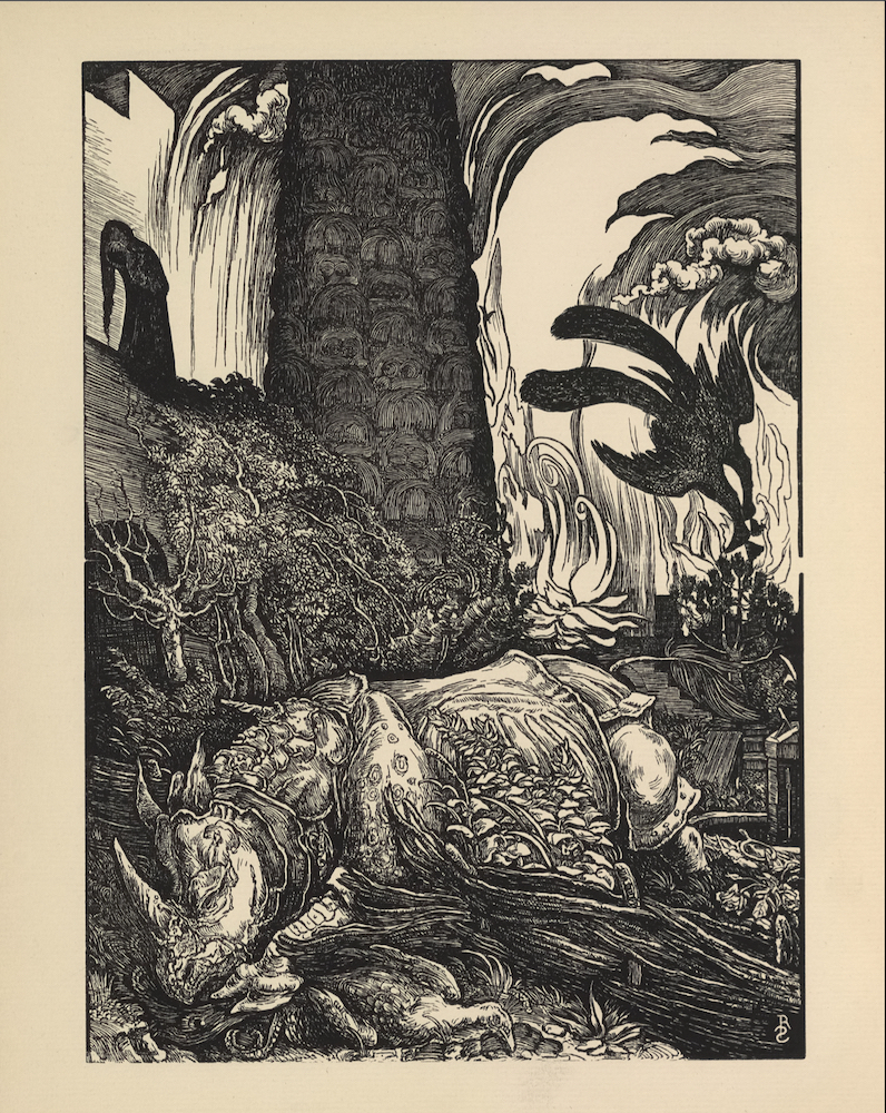
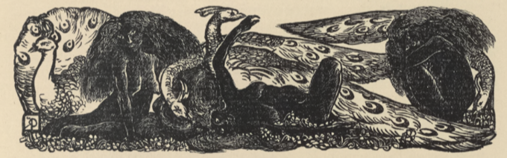
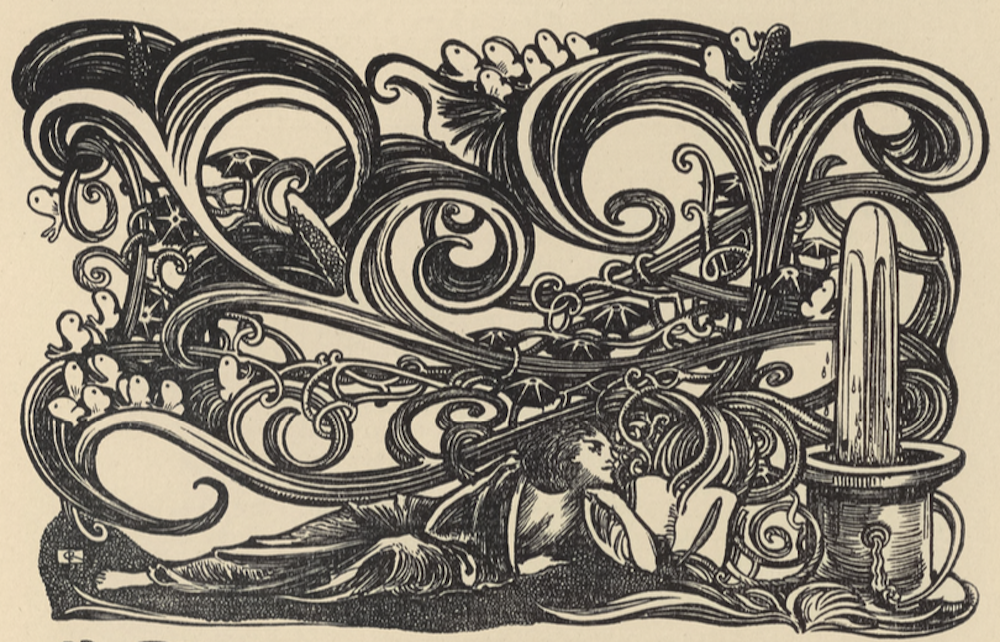
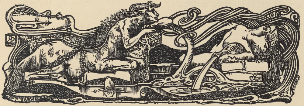
The frontispiece by Reginald Savage, a wood-engraved illustration for Ricketts’s “The Marred Face,” references the Pre-Raphaelites in it its claustrophobic composition and symbolic detail, while also paying homage to Dürer’s Rhinoceros and William Blake’s Behemoth (fig. 4). The latter allusion is apt, as the fairy tale it illustrates opens with an epigraph from Blake’s Jerusalem: “My Mountains are My Own and I Will Keep Them to Myself” (“Marred,” 1). An allegorical tale of love and betrayal set in ancient China, “The Marred Face” ends apocalyptically with both the monstrous Behemoth and the fatal Queen, kissing the face of her decapitated lover, going down in flames. Stephen Corbett suggests that Ricketts’s main interest in this fantastic tale lies in its ornamental prose rather than its plot or character, but he does recognize the work’s allegorical representation of the isolated artist figure (105). This figure appears again in his (unsigned) essay on French poet “Maurice de Guérin.” Ricketts celebrates the “holy seclusion” from the world evoked in de Guérin’s non-realistic works, with their “clatter of centaur heels” (11, 12). For the accompanying headpiece, Ricketts designed an elaborate composition depicting a centaur set amid flowing water and intricate interlacings (fig. 5). The headpiece not only illuminates the thematic core of the de Guérin essay and visually chimes with the volume’s other textual ornaments, but also anticipates one of the principal motifs of the Dial’s third volume, published the following year with “Centaurs” by T. Sturge Moore as its frontispiece.
In both his editorial selections and his visual and verbal contributions, Ricketts favoured the fantastic as a mode capable of expressing meaning symbolically. Notably, the second Dial’s literary contents open and close with exotic fairy tales by Ricketts that explore something of the “transfigured life” expressed in Document’s symbolic details. T. Sturge Moore’s “King Comfort” also uses the fantastic setting of a remote castle rife with intrigue, betrayal, sex, and death in an allegory focused on the titular isolated and misunderstood King and his desire for Privacy. In this way, the “fantastic details” and “old ornamentalness” of Document weave throughout the second volume’s literature, art, and textual decoration.
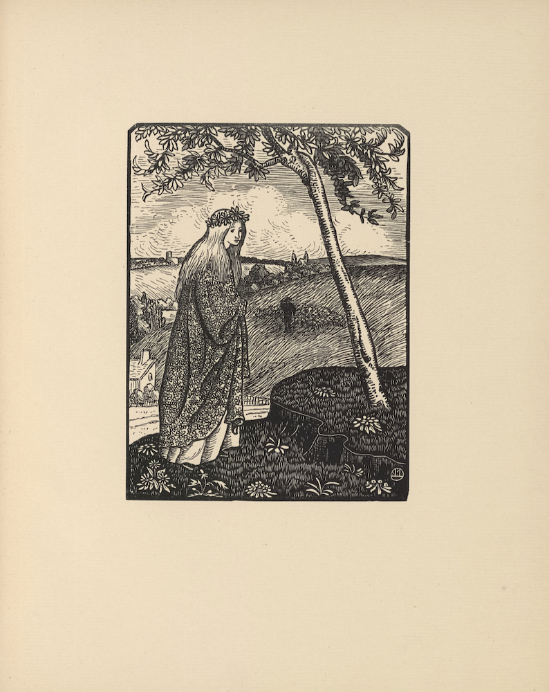
John Gray contributed three poems, all influenced by French writers, and Sturge Moore contributed eight brief lyrics, including an elegy “To the Memory of Arthur Rimbaud” and ekphrastic poems after specific artworks by Puvis de Chavannes and Shannon, as well as one on myth of “Pygmalion,” whose sculpture comes to life. Both Gray and Moore also offered original translations of French verses. The former imitated Paul Verlaine’s “Parsifal,” a poem about conquering physical desire to realize spiritual truths, while the latter took a more sensuous approach with “Les Chercheuses de Poux” (“The Lice-Hunters”), a translation that bears comparison with Ezra Pound’s later rendition of the French original. The magazine’s French connections were reinforced in Lucien Pissarro’s lovely woodcut “Sister of the Woods,” whose simplicity of design and use of white line engraving contrasts the style of the English-trained Ricketts and Savage (fig. 6).
Herbert Horne, editor of the Century Guild Hobby Horse, contributed his first and only poem to the Dial, “To the Flowers, to Weep,” perhaps in exchange for the publication of Charles Shannon’s lithograph, “Vallatus Lilis,” in the previous year’s Hobby Horse. His was the only poem praised by the critics; the Saturday Review singled it out as a “charming lyric” (“New Books,” 462). Shannon’s three lithographs in the second Dial show his increasing mastery of the medium’s potential for the effects of light and shade, in contrast to the black and white masses and lines of the woodcut. The lantern’s rays in “Shepherd in a Mist” show the lithograph’s capacity to express gradations of illumination, while “Repeated Bend” and “With Viol and Flute” demonstrate the soft tonal effects that can be achieved on the stone.
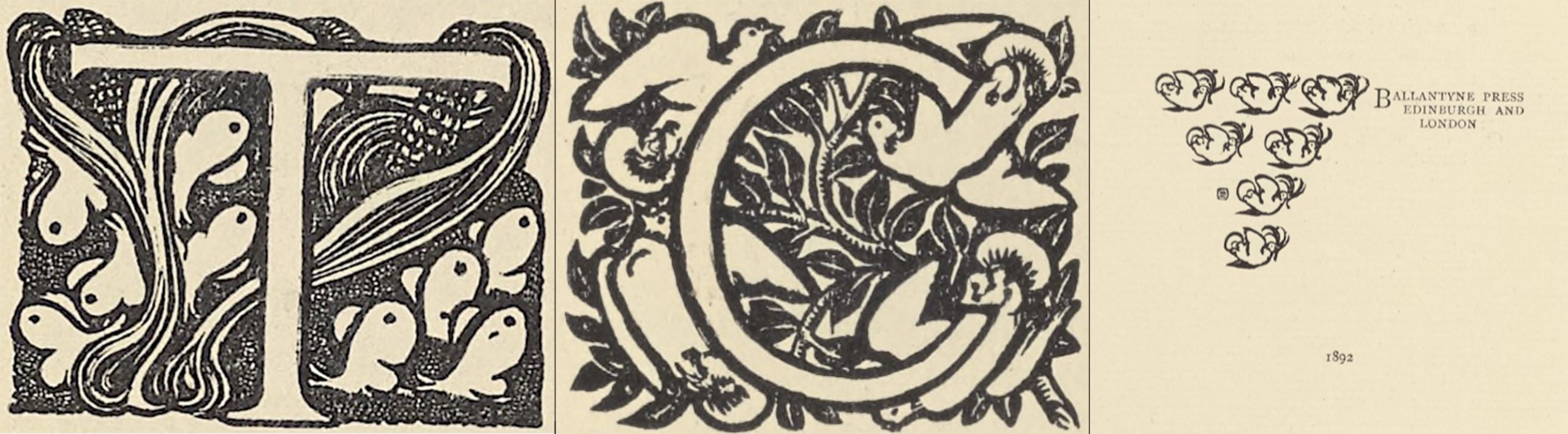
If motifs of flames, flowers, butterflies, and monsters form a pattern from cover to cover in the Dial’s first number, they return to add visual harmony to its second number and thus to the series as a whole. Rather than the open butterfly with outstretched wings, however, the new volume favoured flocks of butterflies with closed or semi-closed wings, chiming with the flock of doves found on the cover and in a number of textual ornaments (see figs. 2, 3, and 7). The latter may pay tribute to the new partnership with the Ballantyne Press, whose colophon, printed at the back of the volume, featured seven white doves (fig. 7). As a work of overall design in the art of the book, the Dial’s second number shows significant development in typography and ornament. As Nicholas Barker rightly observes, Ricketts’s desire to have artistic control over every aspect of the magazine’s production made him a “real pioneer, the ancestor of the modern designer” (Foreword in Watery xxi).
Ricketts and Shannon were justifiably proud of the Dial’s second volume and sent a complimentary copy to William Morris. The older man confessed that to him, “the talent and the aberration of the talent seemed…in about equal portions,” but graciously invited the two editors to visit him at Merton (Ricketts, Self-Portrait 20). Morris refrained from commenting on the literary contents, but reviews in the press once again dismissed the Dial’s poems, fairy tales, and essays, with the Academy critic calling them “sheer nonsense” (“The Art Magazines” 332). The same critic, however, acknowledged that the graphic art (including textual ornaments) “of the whole number…is so fresh and strange that one does not care to criticise it too minutely” (ibid). The Saturday Review went further, saying that “Mr. Shannon’s lithographs. . .and Mr. Ricketts’s cuts in the text, are designs that appeal, as music does, to the artist” (“New Books” 462). The aesthetic appeal of volume 2 of the Dial lies in the harmony of its design and the success of its conception and execution. It is no wonder that it influenced the arts of wood-engraving, lithography, and the making of little magazines at the turn of the last century.
©2019 Lorraine Janzen Kooistra, FRSC, Professor of English, Ryerson University
Works Cited
- “The Art Magazines.” Rev. of The Dial, vol. 2. Academy, 2 April 1892, p. 332.
- “Centaurs,” an experiment in line designed by Reginald Savage and engraved on the wood by Charles Ricketts. The Dial: An Occasional Publication, vol. 3, 1893, frontispiece.
- Corbett, David Peters. “Symbolism in the ‘Little Magazines’: The Dial (1889-1897), The Pageant (1896-97), and The Dome (1897-1900).” The Oxford Critical and Cultural History of Modernist Magazines, edited by Peter Brooker and Andrew Thacker, Oxford University Press, 2009, pp. 101-119.
- Gray, John. “Heart’s Demesne.” The Dial: An Occasional Publication, vol. 2, 1892, p. 23.
- —. “Les Demoiselles de Sauve.” The Dial: An Occasional Publication, vol. 2, 1892, p. 24.
- —. “Parsifal, imitated from the French of Arthur Rimbaud,” The Dial: An Occasional Publication, vol. 2, 1892, p. 8
- Horne, Herbert. “To the Flowers, To Weep.” The Dial: An Occasional Publication, vol. 2, 1892, p. 9.
- Moore, T. Sturge. “King Comfort.” The Dial: An Occasional Publication, vol. 2, 1892, pp. 19-22.
- —. “On a Picture by Puvis de Chavanes”; “Bitten Apples”; “Love Lies Bleeding: Song for a Fairy Tale”; “Little Brown Wood Mouse”; “Gust-Disgusted Geese.” The Dial: An Occasional Publication, vol. 2, 1892, pp. 15-16.
- —. “Les Chercheuses de Poux, after Rimbaud”; “Pygmalion”; and “On a Drawing by C.H.S.” The Dial: An Occasional Publication, vol. 2, 1892, pp. 17-18.
- —. “To the Memory of Arthur Rimbaud.” The Dial: An Occasional Publication, vol. 2, 1892, p. 10.
- “New Books and Reprints.” Rev. of The Dial, vol. 2. Saturday Review, 15 October, 1892, p. 462.
- Pissarro, Lucien. “Sister of the Woods.” The Dial: An Occasional Publication, vol. 2, 1892, np.
- Prospectus for Dial, vol. 2. Included in ephemera in British Library bound copy of “The Vale Press and the Modern Revival of Printing,” by H.C. Marillier, 1900.
- Ricketts, Charles. “The Bridal”; Ella the She-Bear”; “Snow in Spring.” The Dial: An Occasional Publication, vol. 2, 1892, pp. 29-33.
- —. “The Marred Face.” The Dial: An Occasional Publication, vol. 2, 1892, pp. 1-7.
- —. Self-Portrait Taken from Letters and Journals of Charles Ricketts, edited by Cecil Lewis, collected and compiled by T. Sturge Moore. Peter Davies, 1939.
- [Ricketts, Charles]. “Maurice de Guérin.” The Dial: An Occasional Publication, vol. 2, 1892, pp. 11-14
- —. “The Unwritten Book.” The Dial: An Occasional Publication, vol. 2, 1892, pp. 25-28.
- Savage, Reginald. “The Palace Burns and Behemoth.” The Dial: An Occasional Publication, vol. 2, 1892, frontispiece.
- Shannon, Charles. “Repeated Bend.” The Dial: An Occasional Publication, vol. 2, 1892, np.
- —. “Shepherd in a Mist.” The Dial: An Occasional Publication, vol. 2, 1892, np.
- —. “Vallatus Lilis: Being a Drawing on the Stone.” Century Guild Hobby Horse, vol. 6, 1891, np.
- —. “With Viol and Flute.” The Dial: An Occasional Publication, vol. 2, 1892, np.
- Watry, Maureen. The Vale Press: Charles Ricketts, A Publisher in Earnest. Oak Knoll Press/The British Library, 2004.
MLA citation:
Kooistra, Lorraine Janzen. “Critical Introduction to Volume 2 of The Dial (1892)” The Dial Digital Edition, Yellow Nineties 2.0, edited by Lorraine Janzen Kooistra, Ryerson University Centre for Digital Humanities, 2019, https://1890s.ca/dialv2_critical_introduction/